Level 2 · One area of a page
Designing sections & layout
In the Design panel of a section you set how this area is structured and how it looks – layout, background, height, alignment.
Where to find it
In this help, “section” means an article or an element group. Both carry the same fields. A page with three articles stacked on top of each other therefore has three sections.
How to get there: Site structure → page → article icon → edit the article. In the edit form the fields are grouped into collapsible areas (“panels”, the grey bars). Just before the Expert settings panel is the Design panel – expand it, all the fields are inside.
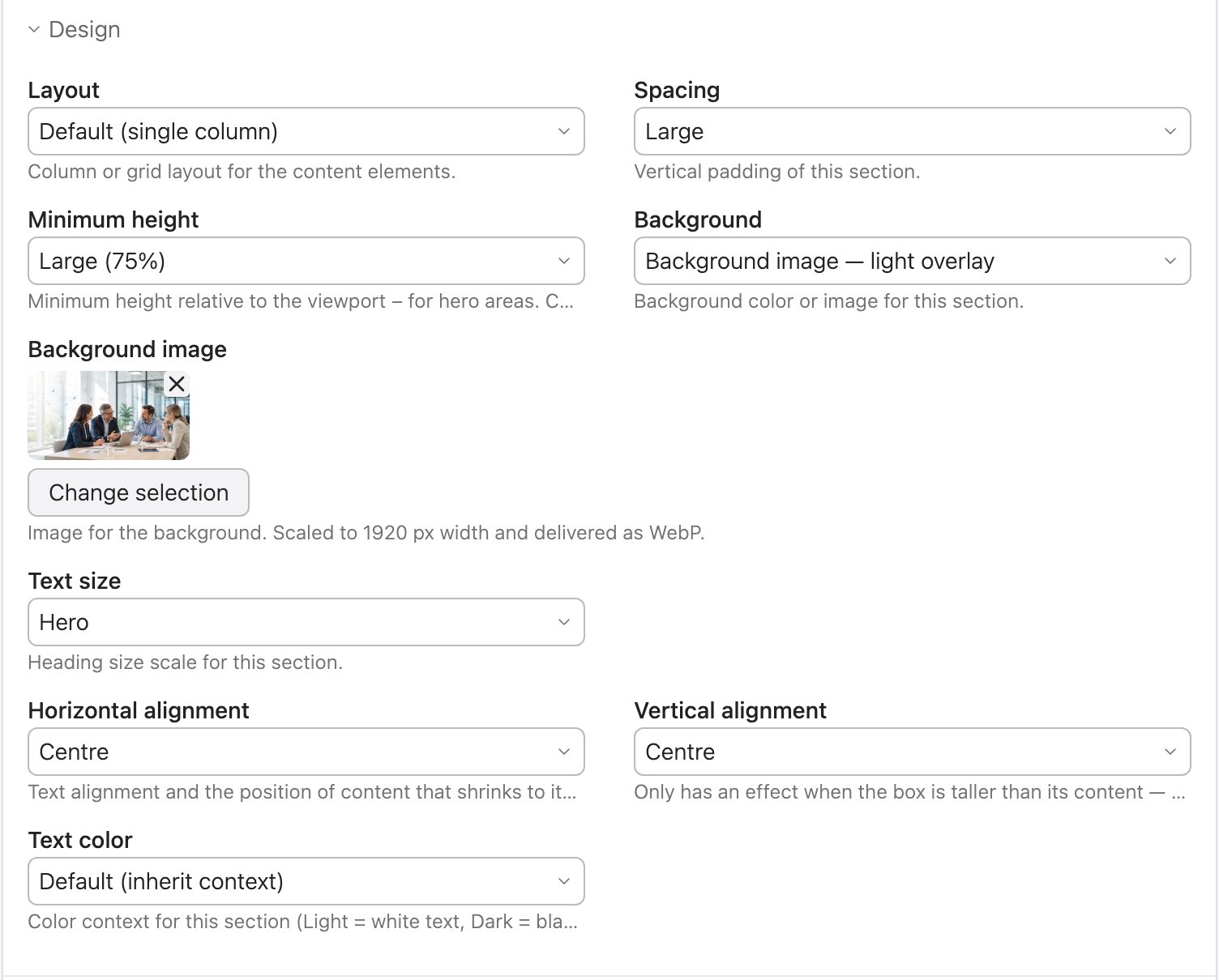
Layout
Columns for the content elements in this section. On narrow screens every variant stacks into a single column automatically.
| Option | Meaning |
|---|---|
| Default (single column) | Elements stacked. |
| Two / Three / Four / Six columns | Columns of equal width. |
| Asymmetric 2:1 / 1:2 | Two columns, one twice as wide. |
| Auto grid | As many equal columns as fit side by side. |
| Text + image | Two centred columns with a large gap – for text next to an image. |
| Content + sidebar | A wide column plus a narrow side column. |
Spacing
The vertical padding of the section (top/bottom): Default, Small, Large. On an element group the field has the same name and sets the group's inner padding.
Minimum height
Turns a section into a hero area – a surface at least a certain share of the screen high.
| Option | Height |
|---|---|
| Default (content) | As high as the content. |
| Third / Half / Large / Full | 33 % · 50 % · 75 % · 100 % of the screen height (slightly raised on phones so heroes don't look flat). |
Background
Colour, image, video, gradient or glass behind the whole section.
| Group | Options |
|---|---|
| Surfaces | Base surface · Offset surface · Primary colour · Secondary colour · None (remove surface) |
| Background image | without overlay · dark overlay · light · primary · secondary colour · gradient |
| Background video | like the image, with the same overlays |
| Gradients | subtle · primary colour · secondary colour · Gradient (free) · animated |
| Glass | Glass · Glass dark (frosted-glass effect) |
- Dark / light / primary / secondary / gradient overlay: the text colour adjusts along with it (dark overlay → light text). You don't need to do anything in the Text color field.
- “Background image” without overlay: there is no darkening here. Set the Text color to match the image yourself (light image → “Black”, dark image → “White”).
Choosing a background image
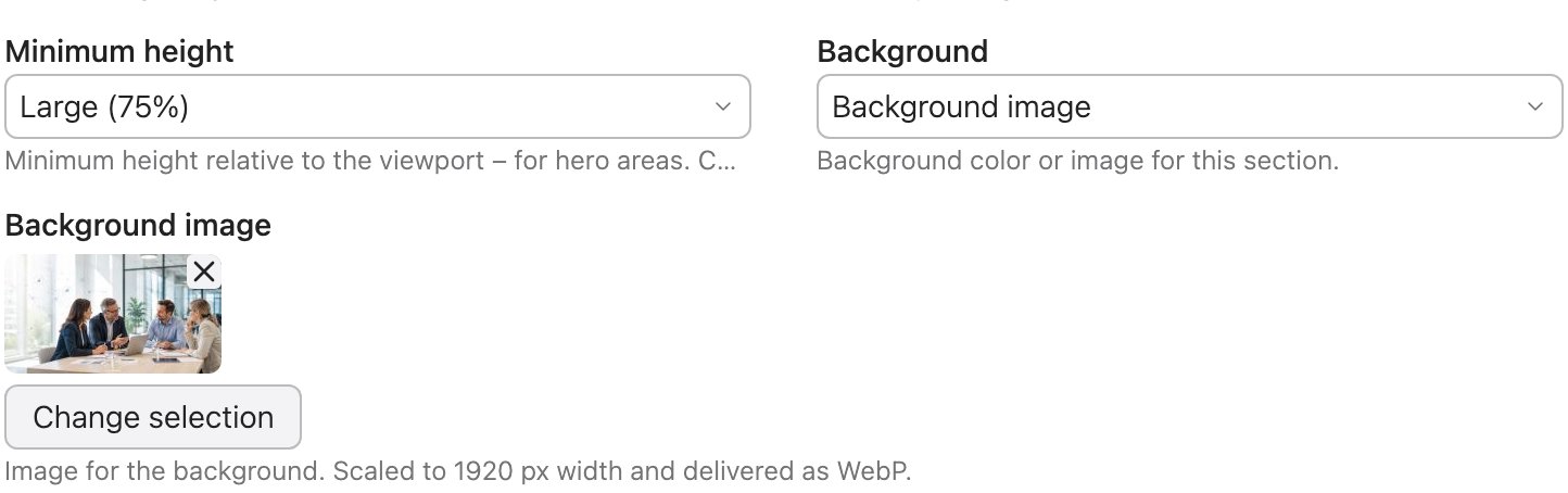
As soon as you choose a “Background image …” option, the Background image field appears below it: choose an image from the file manager there. It is automatically scaled to 1920 px width and delivered as WebP; smaller variants for phone and tablet are created automatically.
Background video
With a “Background video …” option two fields appear: Background video (MP4 or WebM, plays muted in a loop) and Still image. A pause button is added automatically – without it, a moving background violates accessibility rules. The still image is shown while the video loads, when it is paused, and when it doesn't start at all (no JavaScript, reduced motion, unsupported format). A still image is therefore required – without one, the section stays empty in these cases. More on this under Ready-made building blocks.
Text size
Scales the headings in this section: Small, Default, Large, Hero – independently of the Design Studio slider.
Alignment
| Field | Options | Effect |
|---|---|---|
| Horizontal alignment | Left · Centre · Right | Text alignment and the position of content that shrinks to its own width (e.g. buttons). |
| Vertical alignment | Top · Centre · Bottom | Only has an effect when the box is taller than its content – e.g. with a minimum height or columns of different lengths. |
Text colour
Sets the text context of the section:
| Default | inherits the context from outside. |
| White | light text – for dark backgrounds. |
| Black | dark text – for light backgrounds. |
| Primary colour / Secondary colour | Headings and text in the brand or second colour. |
Element groups only: column gap & dividers
| Field | Options | Effect |
|---|---|---|
| Column gap | Default · None · Small · Medium · Large · Extra large | Spacing between the elements of the group – horizontally and vertically. Not to be confused with Spacing (the group's padding). |
| Dividers | None · Between columns | Vertical lines in the column gaps. They disappear when the grid wraps to a single column. Meant for plain columns without their own card surface. |
An element group can also be framed as a card itself or span several columns (fields Element Style and Width – see Content elements).
Inline styles
In the Expert settings panel, right after the
CSS ID/class field, there is Inline styles for
fine-tuning that no select menu covers – e.g.
--av-gutter: 2rem. Use it sparingly; most things can be
solved with the fields above. The design variables are explained under
For developers.